While cleaning up the office, I stumbled across a book on the shelf titled '1001 Albums You Must Hear Before You Die'. Even though it had 'Updated Edition' brandished across the top of it, it had been a couple of years since its release in 2007.
As I delved in, I became fixated on the album cover artwork. There was an incredible range of album covers from the early 1950s, with artist portraits and bold typography, to the late 2000s, when the integration of digital photography became the rage.
So, I've pulled together my favourites and thrown in a couple of modern-day covers, too.
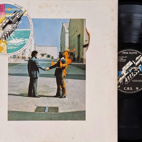
Pink Floyd - Wish You Were Here
The prism from 'Darkside of the Moon' is one of the most iconic album covers, but in my eyes, the 'Wish You Were Here' album is just a synonym.
Storm Thorgerson designed the covers for Pink Floyd, which were photographed by Aubrey Powell of the design group Hipgnosis. Over the years, they have created several iconic album covers for Pink Floyd.
The composition of this album cover first draws me into the blank space border and the fire burning from the man breaking the plain of the space. The drain in the foreground feels intentional and centres the artwork, unlike nowadays, when I think it would be photoshopped out. The shadows from the surrounding buildings also help to create a halo of light around the two people.
After deep diving into my back catalogue blogs and Wikipedia, I learnt the theme of this album was based around absence and yearning for former bandmate Syd Barrett, who had left the group due to mental health issues. The burning man in the image symbolises this theme of longing for someone who is not there. While also touching on the empty gesture of a handshake and the fear of getting burnt by the music industry. Researching this album and finding out that this photo was, in fact, real blew my mind.
My love for this album started with the music; the cover has now enhanced it. Every aspect of the experience has been carefully thought out, such as the original albums coming in black shrink-wrap. This was aimed at conveying that the album's essence was more significant than its commercial packaging. They took a lot of care to showcase the themes of their bandmate's absence, his being burnt out by the music industry, and the empty promises he was given.
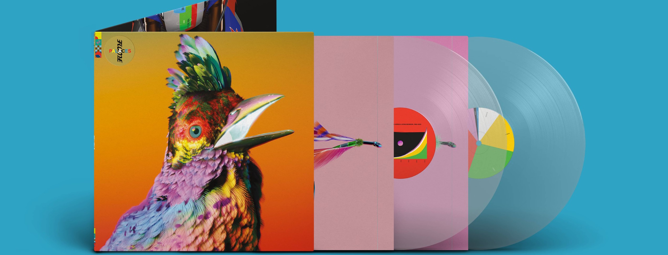
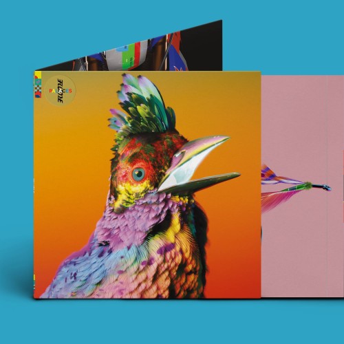
Flume - Palaces
Flume's "Palaces" album, released in 2022, is one of the newest albums on this list. Flume collaborates with Australian artist Jonathan Zawada, who combines nature and electronic media to create surreal, vibrant art pieces. Collaborating previously on Flumes' Skins' album, which showed a digital representation of a protea. The 'Palaces' showcase cover art features a peacock. The peacock's feathers are rendered in fine detail, radiating with vibrant colours. The colour captures your attention while juxtaposed against the soft background that appears digital and organic.
The cover symbolises Flume's music's vibrancy and connection to his Australian roots. While writing this album, it was COVID lockdown when Flume returned to Australia and bought a house, which he called his 'Palace'. The surrounding environment inspired him to find peace and creativity amidst contrasting electronic music and natural environments: a simple existence and a grounded sense of being home. The blend between nature and electronic music is evident; they were trying to reflect this on the album cover. This duality reflects the album's core theme of merging the natural world with electronic music.
Once again, showcasing Flume's ambigram logo and symbols developed during his 'Hi this is Flume' mixtape completes the cover art, which has evolved from all his previous artwork to combine and make the perfect package. I'm a huge fan of Jonathan's illustration and the detail he puts into his work; the cover art is a beautiful piece that captures the vibrant, transformative energy of the music and Flume's ongoing innovation in electronic music.
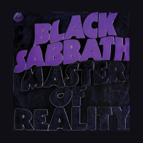
Black Sabbath - Master of Reality
With its simplistic typographic treatment, this album cover was far before its time. The Bloomsbury Group, overseen by Keith Macmillan, took a different route with the "Master of Reality" album. The stark, minimalist cover featured a predominantly black background with the album's title and band name in large, bold typography.
The font used for the text is a heavily modified version of the Avant Garde Gothic typeface, which was popular in the late 1960s and early 1970s. With clean lines and modernist influence, this font choice was somewhat unconventional for a heavy metal band at the time, which typically favoured more elaborate or gothic fonts. Using purple for the text adds a touch of psychedelia, reflecting their aesthetic while contrasting sharply against the black background.
In an interview with Rolling Stones, Macmillan said that to make the U.K. release stand out, Bloomsbury embossed the bubbly lettering so that you could feel it with your fingers. Having the album's title embossed in black would have expanded on the dark gothic theme of the album.
Today's digital versions only show the band name and title in an RGB purple (a beautiful tone), but they could never do justice to the original print versions. The cover art for Black Sabbath's "Master of Reality" is a masterclass in minimalist design that perfectly encapsulates the essence of the band's sound and themes. In an era where album covers often relied on elaborate artwork, "Master of Reality" stands out for its minimalism and bold design choices.
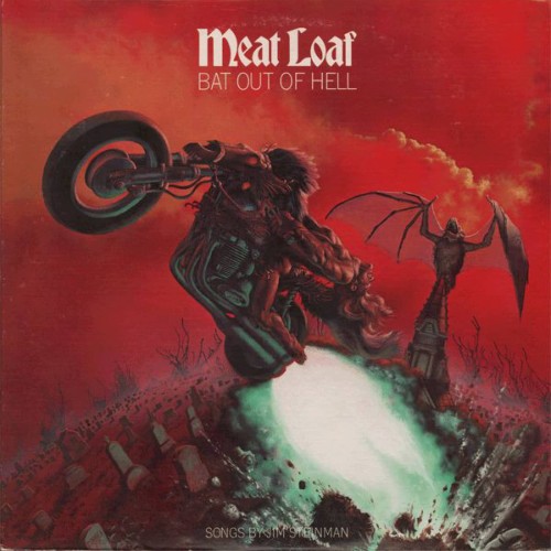
Meatloaf - Bat out of hell
After spending many years travelling around in the backseat of my parent's car listening to this album, I became familiar with the cover as it rattled around in the centre console.
The visual graphics reminisce of a more metal rock theme cover, like Megadeath or Iron Madian. The "Bat Out of Hell" cover art is a striking piece of visual storytelling, combining fantasy elements.
Illustrator Richard Corben created the background graphic of a muscular, long-haired man on a motorcycle bursting out of a graveyard; the rear wheel enveloped in flames. Behind him, a gigantic bat with outstretched wings dominates the sky. The colour palette is bold and intense, dominated by reds, oranges, and blacks. These colours evoke a sense of hellfire in a hyper-realistic style.
The typography on the cover is positioned at the top, ensuring that it is the first thing that catches the viewer's eye. The album title is in a gothic-style font with sharp, jagged edges. After researching the design, I loved the small details designers would have to work in, like printing out every lyric, which would be expected at the time.
This iconic cover remains a standout to me, symbolising the power of visual art to elevate the music.
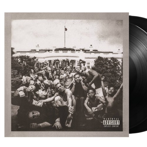
Kendrick Lamar - To Pimp a Butterfly
After initially hearing this album in a dusty cold flat in Dunedin, it blasted through a TV in 2015. I've spent years listening to this album and consider 'To Pimp a Butterfly' to be one of the greatest. I've never stopped to look at the cover and consider how the visual displays the album's themes.
After his previous album 'Good kid, m.A.A.d city' Kendrick's evolution from Compton to exploring race, power and identity in America. For the album cover, he teamed up with French photographer Denis Rouvre, creating a powerful visual statement. The black-and-white photograph of a group of African-American men, including Kendrick, standing in front of the White House. It's raw and unpolished, with a documentary-style aesthetic that gives it a sense of realism.
An album title doesn't appear on the front cover, but it is a deliberate choice that makes you focus on the image. This minimalist approach allows the photograph to speak for itself, allowing viewers to delve deeper into the imagery, focusing on the individuals and their emotions. Like the music, it makes you stop and think about it.
'To Pimp a Butterfly' cover art is a masterful example of how visual imagery can enhance the themes of a musical work. I could go down a deep rabbit hole regarding symbolic references and double entendres in Kendricks's work, but I could never do it justice. If you want to delve into it more, then check out this journal here
Some honourable mentions:
Ol dirty bastard - Return to the 36 chambers
Santana - Abraxas
Elton John - Yellow Brick Road
Led Zeppelin - Led Zepplin IV
Green Day - Dookie
Sticky Fingers - Caress Your Soul
Kenny Beats - Louie
In today's music, album covers are sometimes overlooked as merely thumbnails in the bottom corner of Shopify. But these are artist masterpieces that visualise the album's emotion and can instantly make it recognisable. I've found a new appreciation for the artist who created these—the importance of physically holding and feeling the artwork and looking at how it has aged.
Many of these covers hold a nostalgic factor to me in one way, which is why I'm so interested in them. But what are your thoughts? What did I miss?